 我的书签
我的书签
 添加书签
添加书签 移除书签
移除书签- Modal对话框
- 何时使用
- 单独引入此组件
- 代码演示
- API
- NzModalServiceservice
- 注意
- 采用服务方式创建普通模式对话框
- 确认框模式 - NzModalService.method()
- 相关类型定义
- NzModalService的其他方法/属性service
- NzModalRef
- 全局配置
- ModalButtonOptions(用于自定义底部按钮)
- [nzModalFooter]directive
- NzModalServiceservice
Modal对话框
模态对话框。
何时使用
需要用户处理事务,又不希望跳转页面以致打断工作流程时,可以使用 Modal 在当前页面正中打开一个浮层,承载相应的操作。
另外当需要一个简洁的确认框询问用户时,可以使用精心封装好的 NzModalService.confirm() 等方法。
推荐使用加载Component的方式弹出Modal,这样弹出层的Component逻辑可以与外层Component完全隔离,并且做到可以随时复用,
在弹出层Component中可以通过依赖注入NzModalRef方式直接获取模态框的组件实例,用于控制在弹出层组件中控制模态框行为。
单独引入此组件
想要了解更多关于单独引入组件的内容,可以在快速上手页面进行查看。
import { NzModalModule } from 'ng-zorro-antd/modal';
代码演示

基本
第一个对话框。
import { Component } from '@angular/core';@Component({selector: 'nz-demo-modal-basic',template: `<button nz-button [nzType]="'primary'" (click)="showModal()"><span>Show Modal</span></button><nz-modal [(nzVisible)]="isVisible" nzTitle="The first Modal" (nzOnCancel)="handleCancel()" (nzOnOk)="handleOk()"><p>Content one</p><p>Content two</p><p>Content three</p></nz-modal>`})export class NzDemoModalBasicComponent {isVisible = false;constructor() {}showModal(): void {this.isVisible = true;}handleOk(): void {console.log('Button ok clicked!');this.isVisible = false;}handleCancel(): void {console.log('Button cancel clicked!');this.isVisible = false;}}

自定义页脚
更复杂的例子,自定义了页脚的按钮,点击提交后进入 loading 状态,完成后关闭。
不需要默认确定取消按钮时,你可以把 nzFooter 设为 null。
import { Component } from '@angular/core';@Component({selector: 'nz-demo-modal-footer',template: `<button nz-button nzType="primary" (click)="showModal()"><span>Show Modal</span></button><nz-modal[(nzVisible)]="isVisible"[nzTitle]="modalTitle"[nzContent]="modalContent"[nzFooter]="modalFooter"(nzOnCancel)="handleCancel()"><ng-template #modalTitle>Custom Modal Title</ng-template><ng-template #modalContent><p>Modal Content</p><p>Modal Content</p><p>Modal Content</p><p>Modal Content</p><p>Modal Content</p></ng-template><ng-template #modalFooter><span>Modal Footer: </span><button nz-button nzType="default" (click)="handleCancel()">Custom Callback</button><button nz-button nzType="primary" (click)="handleOk()" [nzLoading]="isConfirmLoading">Custom Submit</button></ng-template></nz-modal>`})export class NzDemoModalFooterComponent {isVisible = false;isConfirmLoading = false;constructor() {}showModal(): void {this.isVisible = true;}handleOk(): void {this.isConfirmLoading = true;setTimeout(() => {this.isVisible = false;this.isConfirmLoading = false;}, 3000);}handleCancel(): void {this.isVisible = false;}}

确认对话框
使用 NzModalService.confirm() 可以快捷地弹出确认框。
import { Component } from '@angular/core';import { NzModalService } from 'ng-zorro-antd/modal';@Component({selector: 'nz-demo-modal-confirm',template: `<button nz-button nzType="info" (click)="showConfirm()">Confirm</button><button nz-button nzType="dashed" (click)="showDeleteConfirm()">Delete</button>`,styles: [`button {margin-right: 8px;}`]})export class NzDemoModalConfirmComponent {constructor(private modalService: NzModalService) {}showConfirm(): void {this.modalService.confirm({nzTitle: '<i>Do you Want to delete these items?</i>',nzContent: '<b>Some descriptions</b>',nzOnOk: () => console.log('OK')});}showDeleteConfirm(): void {this.modalService.confirm({nzTitle: 'Are you sure delete this task?',nzContent: '<b style="color: red;">Some descriptions</b>',nzOkText: 'Yes',nzOkType: 'danger',nzOnOk: () => console.log('OK'),nzCancelText: 'No',nzOnCancel: () => console.log('Cancel')});}}

信息提示
各种类型的信息提示,只提供一个按钮用于关闭。
import { Component } from '@angular/core';import { NzModalService } from 'ng-zorro-antd/modal';@Component({selector: 'nz-demo-modal-info',template: `<button nz-button (click)="info()">Info</button><button nz-button (click)="success()">Success</button><button nz-button (click)="error()">Error</button><button nz-button (click)="warning()">Warning</button>`,styles: [`button {margin-right: 8px;}`]})export class NzDemoModalInfoComponent {constructor(private modalService: NzModalService) {}info(): void {this.modalService.info({nzTitle: 'This is a notification message',nzContent: '<p>some messages...some messages...</p><p>some messages...some messages...</p>',nzOnOk: () => console.log('Info OK')});}success(): void {this.modalService.success({nzTitle: 'This is a success message',nzContent: 'some messages...some messages...'});}error(): void {this.modalService.error({nzTitle: 'This is an error message',nzContent: 'some messages...some messages...'});}warning(): void {this.modalService.warning({nzTitle: 'This is an warning message',nzContent: 'some messages...some messages...'});}}

手动移除
手动关闭modal。
import { Component } from '@angular/core';import { NzModalService } from 'ng-zorro-antd/modal';@Component({selector: 'nz-demo-modal-manual',template: `<button nz-button (click)="success()">Success</button>`})export class NzDemoModalManualComponent {constructor(private modalService: NzModalService) {}success(): void {const modal = this.modalService.success({nzTitle: 'This is a notification message',nzContent: 'This modal will be destroyed after 1 second'});setTimeout(() => modal.destroy(), 1000);}}

服务方式创建
Modal的service用法,示例中演示了用户自定义模板、自定义component、以及注入模态框实例的方法。
注意 如果使用Component模式,则需要在NgModule中的
declarations和entryComponents加入自定义的Component
/* entryComponents: NzModalCustomComponent */import { Component, Input, TemplateRef } from '@angular/core';import { NzModalRef, NzModalService } from 'ng-zorro-antd/modal';@Component({selector: 'nz-demo-modal-service',template: `<button nz-button nzType="primary" (click)="createModal()"><span>String</span></button><button nz-button nzType="primary" (click)="createTplModal(tplTitle, tplContent, tplFooter)"><span>Template</span></button><ng-template #tplTitle><span>Title Template</span></ng-template><ng-template #tplContent><p>some contents...</p><p>some contents...</p><p>some contents...</p><p>some contents...</p><p>some contents...</p></ng-template><ng-template #tplFooter><button nz-button nzType="primary" (click)="destroyTplModal()" [nzLoading]="tplModalButtonLoading">Close after submit</button></ng-template><br /><br /><button nz-button nzType="primary" (click)="createComponentModal()"><span>Use Component</span></button><button nz-button nzType="primary" (click)="createCustomButtonModal()">Custom Button</button><br /><br /><button nz-button nzType="primary" (click)="openAndCloseAll()">Open more modals then close all after 2s</button><nz-modal [(nzVisible)]="htmlModalVisible" nzMask="false" nzZIndex="1001" nzTitle="Non-service html modal">This is a non-service html modal</nz-modal>`,styles: [`button {margin-right: 8px;}`]})export class NzDemoModalServiceComponent {tplModal: NzModalRef;tplModalButtonLoading = false;htmlModalVisible = false;disabled = false;constructor(private modalService: NzModalService) {}createModal(): void {this.modalService.create({nzTitle: 'Modal Title',nzContent: 'string, will close after 1 sec',nzClosable: false,nzOnOk: () => new Promise(resolve => setTimeout(resolve, 1000))});}createTplModal(tplTitle: TemplateRef<{}>, tplContent: TemplateRef<{}>, tplFooter: TemplateRef<{}>): void {this.tplModal = this.modalService.create({nzTitle: tplTitle,nzContent: tplContent,nzFooter: tplFooter,nzMaskClosable: false,nzClosable: false,nzOnOk: () => console.log('Click ok')});}destroyTplModal(): void {this.tplModalButtonLoading = true;setTimeout(() => {this.tplModalButtonLoading = false;this.tplModal.destroy();}, 1000);}createComponentModal(): void {const modal = this.modalService.create({nzTitle: 'Modal Title',nzContent: NzModalCustomComponent,nzComponentParams: {title: 'title in component',subtitle: 'component sub title,will be changed after 2 sec'},nzFooter: [{label: 'change component title from outside',onClick: componentInstance => {componentInstance!.title = 'title in inner component is changed';}}]});modal.afterOpen.subscribe(() => console.log('[afterOpen] emitted!'));// Return a result when closedmodal.afterClose.subscribe(result => console.log('[afterClose] The result is:', result));// delay until modal instance createdsetTimeout(() => {const instance = modal.getContentComponent();instance.subtitle = 'sub title is changed';}, 2000);}createCustomButtonModal(): void {const modal: NzModalRef = this.modalService.create({nzTitle: 'custom button demo',nzContent: 'pass array of button config to nzFooter to create multiple buttons',nzFooter: [{label: 'Close',shape: 'default',onClick: () => modal.destroy()},{label: 'Confirm',type: 'primary',onClick: () =>this.modalService.confirm({ nzTitle: 'Confirm Modal Title', nzContent: 'Confirm Modal Content' })},{label: 'Change Button Status',type: 'danger',loading: false,onClick(): void {this.loading = true;setTimeout(() => (this.loading = false), 1000);setTimeout(() => {this.loading = false;this.disabled = true;this.label = 'can not be clicked!';}, 2000);}},{label: 'async load',type: 'dashed',onClick: () => new Promise(resolve => setTimeout(resolve, 2000))}]});}openAndCloseAll(): void {let pos = 0;['create', 'info', 'success', 'error'].forEach(method =>// @ts-ignorethis.modalService[method]({nzMask: false,nzTitle: `Test ${method} title`,nzContent: `Test content: <b>${method}</b>`,nzStyle: { position: 'absolute', top: `${pos * 70}px`, left: `${pos++ * 300}px` }}));this.htmlModalVisible = true;this.modalService.afterAllClose.subscribe(() => console.log('afterAllClose emitted!'));setTimeout(() => this.modalService.closeAll(), 2000);}}@Component({selector: 'nz-modal-custom-component',template: `<div><h2>{{ title }}</h2><h4>{{ subtitle }}</h4><p><span>Get Modal instance in component</span><button nz-button [nzType]="'primary'" (click)="destroyModal()">destroy modal in the component</button></p></div>`})export class NzModalCustomComponent {@Input() title: string;@Input() subtitle: string;constructor(private modal: NzModalRef) {}destroyModal(): void {this.modal.destroy({ data: 'this the result data' });}}

异步关闭
点击确定后异步关闭对话框,例如提交表单。
import { Component } from '@angular/core';@Component({selector: 'nz-demo-modal-async',template: `<button nz-button nzType="primary" (click)="showModal()"><span>Show Modal</span></button><nz-modal[(nzVisible)]="isVisible"nzTitle="Modal Title"(nzOnCancel)="handleCancel()"(nzOnOk)="handleOk()"[nzOkLoading]="isOkLoading"><p>Modal Content</p></nz-modal>`})export class NzDemoModalAsyncComponent {isVisible = false;isOkLoading = false;showModal(): void {this.isVisible = true;}handleOk(): void {this.isOkLoading = true;setTimeout(() => {this.isVisible = false;this.isOkLoading = false;}, 3000);}handleCancel(): void {this.isVisible = false;}}

自定义页脚(2)
使用 nzModalFooter 指令自定义了页脚的按钮。
/* entryComponents: NzModalCustomFooterComponent */import { Component } from '@angular/core';import { NzModalService, NzModalRef } from 'ng-zorro-antd/modal';@Component({selector: 'nz-demo-modal-footer2',template: `<button nz-button nzType="primary" (click)="showModal1()"><span>In Template</span></button><br /><br /><button nz-button nzType="primary" (click)="showModal2()"><span>In Component</span></button><nz-modal [(nzVisible)]="isVisible" nzTitle="Custom Modal Title" (nzOnCancel)="handleCancel()"><div><p>Modal Content</p><p>Modal Content</p><p>Modal Content</p><p>Modal Content</p><p>Modal Content</p></div><div *nzModalFooter><span>Modal Footer: </span><button nz-button nzType="default" (click)="handleCancel()">Custom Callback</button><button nz-button nzType="primary" (click)="handleOk()" [nzLoading]="isConfirmLoading">Custom Submit</button></div></nz-modal>`,styles: []})export class NzDemoModalFooter2Component {isVisible = false;isConfirmLoading = false;constructor(private modalService: NzModalService) {}showModal1(): void {this.isVisible = true;}showModal2(): void {this.modalService.create({nzTitle: 'Modal Title',nzContent: NzModalCustomFooterComponent});}handleOk(): void {this.isConfirmLoading = true;setTimeout(() => {this.isVisible = false;this.isConfirmLoading = false;}, 3000);}handleCancel(): void {this.isVisible = false;}}@Component({selector: 'nz-modal-custom-footer-component',template: `<div><p>Modal Content</p><p>Modal Content</p><p>Modal Content</p><p>Modal Content</p><p>Modal Content</p></div><div *nzModalFooter><button nz-button nzType="default" (click)="destroyModal()">Custom Callback</button><button nz-button nzType="primary" (click)="destroyModal()">Custom Submit</button></div>`})export class NzModalCustomFooterComponent {constructor(private modal: NzModalRef) {}destroyModal(): void {this.modal.destroy();}}

确认对话框
使用 NzModalService.confirm() 可以快捷地弹出确认框。NzOnCancel/NzOnOk 返回 promise 可以延迟关闭
import { Component } from '@angular/core';import { NzModalRef, NzModalService } from 'ng-zorro-antd/modal';@Component({selector: 'nz-demo-modal-confirm-promise',template: `<button nz-button nzType="info" (click)="showConfirm()">Confirm</button>`})export class NzDemoModalConfirmPromiseComponent {confirmModal: NzModalRef; // For testing by nowconstructor(private modal: NzModalService) {}showConfirm(): void {this.confirmModal = this.modal.confirm({nzTitle: 'Do you Want to delete these items?',nzContent: 'When clicked the OK button, this dialog will be closed after 1 second',nzOnOk: () =>new Promise((resolve, reject) => {setTimeout(Math.random() > 0.5 ? resolve : reject, 1000);}).catch(() => console.log('Oops errors!'))});}}
国际化
设置 nzOkText 与 nzCancelText 以自定义按钮文字。
import { Component } from '@angular/core';import { NzModalService } from 'ng-zorro-antd/modal';@Component({selector: 'nz-demo-modal-locale',template: `<div><button nz-button nzType="primary" (click)="showModal()">Modal</button><nz-modal[(nzVisible)]="isVisible"nzTitle="Modal"nzOkText="Ok"nzCancelText="Cancel"(nzOnOk)="handleOk()"(nzOnCancel)="handleCancel()"><p>Bla bla ...</p><p>Bla bla ...</p><p>Bla bla ...</p></nz-modal></div><br /><button nz-button nzType="info" (click)="showConfirm()">Confirm</button>`})export class NzDemoModalLocaleComponent {isVisible = false;constructor(private modalService: NzModalService) {}showModal(): void {this.isVisible = true;}handleOk(): void {this.isVisible = false;}handleCancel(): void {this.isVisible = false;}showConfirm(): void {this.modalService.confirm({nzTitle: 'Confirm',nzContent: 'Bla bla ...',nzOkText: 'OK',nzCancelText: 'Cancel'});}}
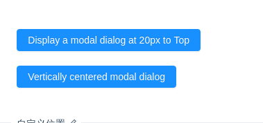
自定义位置
您可以直接使用 nzStyle.top 或配合其他样式来设置对话框位置。
注意 由于Angular的样式隔离,若在Component中没有加入
encapsulation: ViewEncapsulation.None,则您可能需要在自定义样式内采用::ng-deep来覆盖NgZorro的样式
import { Component } from '@angular/core';@Component({selector: 'nz-demo-modal-position',template: `<button nz-button nzType="primary" (click)="showModalTop()">Display a modal dialog at 20px to Top</button><nz-modal[nzStyle]="{ top: '20px' }"[(nzVisible)]="isVisibleTop"nzTitle="20px to Top"(nzOnCancel)="handleCancelTop()"(nzOnOk)="handleOkTop()"><p>some contents...</p><p>some contents...</p><p>some contents...</p></nz-modal><br /><br /><button nz-button nzType="primary" (click)="showModalMiddle()">Vertically centered modal dialog</button><nz-modalnzWrapClassName="vertical-center-modal"[(nzVisible)]="isVisibleMiddle"nzTitle="Vertically centered modal dialog"(nzOnCancel)="handleCancelMiddle()"(nzOnOk)="handleOkMiddle()"><p>some contents...</p><p>some contents...</p><p>some contents...</p></nz-modal>`,styles: [`::ng-deep .vertical-center-modal {display: flex;align-items: center;justify-content: center;}::ng-deep .vertical-center-modal .ant-modal {top: 0;}`]})export class NzDemoModalPositionComponent {isVisibleTop = false;isVisibleMiddle = false;showModalTop(): void {this.isVisibleTop = true;}showModalMiddle(): void {this.isVisibleMiddle = true;}handleOkTop(): void {console.log('点击了确定');this.isVisibleTop = false;}handleCancelTop(): void {this.isVisibleTop = false;}handleOkMiddle(): void {console.log('click ok');this.isVisibleMiddle = false;}handleCancelMiddle(): void {this.isVisibleMiddle = false;}}
API
NzModalServiceservice
对话框当前分为2种模式,普通模式 和 确认框模式(即Confirm对话框,通过调用confirm/info/success/error/warning弹出),两种模式对API的支持程度稍有不同。
| 参数 | 说明 | 类型 | 默认值 |
|---|---|---|---|
| nzAfterOpen | Modal 打开后的回调 | EventEmitter | - |
| nzAfterClose | Modal 完全关闭后的回调,可监听close/destroy方法传入的参数 | EventEmitter | - |
| nzBodyStyle | Modal body 样式 | object | - |
| nzCancelText | 取消按钮文字。设为 null 表示不显示取消按钮(若在普通模式下使用了 nzFooter 参数,则该值无效) | string | 取消 |
| nzClosable | 是否显示右上角的关闭按钮。确认框模式下该值无效(默认会被隐藏) | boolean | true |
| nzOkLoading | 确定按钮 loading | boolean | false |
| nzCancelLoading | 取消按钮 loading | boolean | false |
| nzOkDisabled | 是否禁用确定按钮 | boolean | false |
| nzCancelDisabled | 是否禁用取消按钮 | boolean | false |
| nzFooter | 底部内容。1. 仅在普通模式下有效。2. 可通过传入 ModalButtonOptions 来最大程度自定义按钮(详见案例或下方说明)。3. 当不需要底部时,可以设为 null | stringTemplateRefModalButtonOptions | 默认的确定取消按钮 |
| nzGetContainer | 指定 Modal 挂载的 HTML 节点 | HTMLElement() => HTMLElement | 默认容器 |
| nzKeyboard | 是否支持键盘esc关闭 | boolean | true |
| nzMask | 是否展示遮罩 | boolean | true |
| nzMaskClosable | 点击蒙层是否允许关闭 | boolean | true |
| nzMaskStyle | 遮罩样式 | object | - |
| nzOkText | 确认按钮文字。设为 null 表示不显示确认按钮(若在普通模式下使用了 nzFooter 参数,则该值无效) | string | 确定 |
| nzOkType | 确认按钮类型。与button的type类型值一致 | string | primary |
| nzStyle | 可用于设置浮层的样式,调整浮层位置等 | object | - |
| nzTitle | 标题。留空表示不展示标题。TemplateRef的使用方法可参考案例 | stringTemplateRef | - |
| nzVisible | 对话框是否可见。当以 <nz-modal> 标签使用时,请务必使用双向绑定,例如:[(nzVisible)]="visible" | boolean | false |
| nzWidth | 宽度。使用数字时,默认单位为px | stringnumber | 520 |
| nzClassName | 对话框的类名 | string | - |
| nzWrapClassName | 对话框外层容器的类名 | string | - |
| nzZIndex | 设置 Modal 的 z-index | number | 1000 |
| nzOnCancel | 点击遮罩层或右上角叉或取消按钮的回调(若nzContent为Component,则将会以该Component实例作为参数)。注:当以NzModalService.create创建时,此参数应传入function(回调函数)。该函数可返回promise,待执行完毕或promise结束时,将自动关闭对话框(返回false可阻止关闭) | EventEmitter | - |
| nzOnOk | 点击确定回调(若nzContent为Component,则将会以该Component实例作为参数)。注:当以NzModalService.create创建时,此参数应传入function(回调函数)。该函数可返回promise,待执行完毕或promise结束时,将自动关闭对话框(返回false可阻止关闭) | EventEmitter | - |
| nzContent | 内容 | stringTemplateRefComponentng-content | - |
| nzComponentParams | 当nzContent为组件类(Component)时,该参数中的属性将传入nzContent实例中 | object | - |
| nzIconType | 图标 Icon 类型。仅 确认框模式 下有效 | string | question-circle |
注意
<nz-modal>默认关闭后状态不会自动清空, 如果希望每次打开都是新内容,请采用NzModalService服务方式创建对话框(当以服务方式创建时,默认会监听nzAfterClose并销毁对话框)。通过
NzModalService服务方式创建的对话框需要自行管理其生命周期。比如你在页面路由切换时,服务方式创建的对话框并不会被销毁,你需要使用对话框引用来手动销毁(NzModalRef.close()或NzModalRef.destroy())。
采用服务方式创建普通模式对话框
您可调用
NzModalService.create(options)来动态创建普通模式对话框,这里的options是一个对象,支持上方API中给出的支持 普通模式 的参数
确认框模式 - NzModalService.method()
包括:
NzModalService.infoNzModalService.successNzModalService.errorNzModalService.warningNzModalService.confirm以上均为一个函数,参数为 object,与上方API一致。部分属性类型或初始值有所不同,已列在下方:
| 参数 | 说明 | 类型 | 默认值 |
|---|---|---|---|
| nzOnOk | 点击确定按钮时将执行的回调函数(若nzContent为Component,则将会以该Component实例作为参数)。该函数可返回promise,待执行完毕或promise结束时,将自动关闭对话框(返回false可阻止关闭) | function | - |
| nzOnCancel | 点击遮罩层或右上角叉或取消按钮的回调(若nzContent为Component,则将会以该Component实例作为参数)。该函数可返回promise,待执行完毕或promise结束时,将自动关闭对话框(返回false可阻止关闭) | function | - |
| nzWidth | 宽度 | stringnumber | 416 |
| nzMaskClosable | 点击蒙层是否允许关闭 | boolean | false |
以上函数调用后,会返回一个引用,可以通过该引用关闭弹窗。
constructor(modal: NzModalService) {const ref: NzModalRef = modal.info();ref.close(); // 或 ref.destroy(); 将直接销毁对话框}
相关类型定义
NzModalService的其他方法/属性service
| 方法/属性 | 说明 | 类型 |
|---|---|---|
| openModals | 当前打开的所有Modal引用列表 | NzModalRef[] |
| afterAllClose | 所有Modal完全关闭后的回调 | Observable<void> |
| closeAll() | 关闭所有模态框 | function |
NzModalRef
NzModalRef 对象用于控制对话框以及进行内容间的通信
通过服务方式 NzModalService.xxx() 创建的对话框,都会返回一个 NzModalRef 对象,用于操控该对话框(若使用nzContent为Component时,也可通过依赖注入 NzModalRef 方式获得此对象),该对象具有以下方法:
| 方法/属性 | 说明 |
|---|---|
| afterOpen | 同nzAfterOpen,但类型为Observable<void> |
| afterClose | 同nzAfterClose,但类型为Observable<result:any> |
| open() | 打开(显示)对话框。若对话框已销毁,则调用此函数将失效 |
| close(result: any) | 关闭(隐藏)对话框。注:当用于以服务方式创建的对话框,此方法将直接 销毁 对话框(同destroy方法) |
| destroy(result: any) | 销毁对话框。注:仅用于服务方式创建的对话框(非服务方式创建的对话框,此方法只会隐藏对话框) |
| getContentComponent() | 获取对话框内容中nzContent的Component实例instance。注:当对话框还未初始化完毕(ngOnInit未执行)时,此函数将返回undefined |
| triggerOk() | 手动触发nzOnOk |
| triggerCancel() | 手动触发nzOnCancel |
全局配置
全局配置(NZ_MODAL_CONFIG)如果要进行全局默认配置,你可以设置提供商 NZ_MODAL_CONFIG 的值来实现。(如:在你的模块的providers中加入 { provide: NZ_MODAL_CONFIG, useValue: { nzMask: false }},NZ_MODAL_CONFIG 可以从 ng-zorro-antd 中导入)
全局配置,组件默认值,组件层级配置之间的权重如下:
组件层级配置 > 全局配置 > 组件默认值
当前支持的全局配置
{provide: NZ_MODAL_CONFIG,useValue: {nzMask?: boolean; // 是否展示遮罩nzMaskClosable?: boolean; // 点击蒙层是否允许关闭}}
注:全局配置并无默认值,因为nzMask和nzMaskClosable默认值存在于组件中
ModalButtonOptions(用于自定义底部按钮)
可将此类型数组传入 nzFooter,用于自定义底部按钮。
按钮配置项如下(与button组件保持一致):
nzFooter: [{label: string; // 按钮文本type?: string; // 类型shape?: string; // 形状ghost?: boolean; // 是否ghostsize?: string; // 大小autoLoading?: boolean; // 默认为true,若为true时,当onClick返回promise时此按钮将自动置为loading状态// 提示:下方方法的this指向该配置对象自身。当nzContent为组件类时,下方方法传入的contentComponentInstance参数为该组件类的实例// 是否显示该按钮show?: boolean | ((this: ModalButtonOptions, contentComponentInstance?: object) => boolean);// 是否显示为loadingloading?: boolean | ((this: ModalButtonOptions, contentComponentInstance?: object) => boolean);// 是否禁用disabled?: boolean | ((this: ModalButtonOptions, contentComponentInstance?: object) => boolean);// 按钮点击回调onClick?(this: ModalButtonOptions, contentComponentInstance?: object): void | Promise<void> | any;}]
以上配置项也可在运行态实时改变,来触发按钮行为改变。
[nzModalFooter]directive
另一种自定义页脚按钮的方式。
<div *nzModalFooter><button nz-button nzType="default" (click)="handleCancel()">Custom Callback</button><button nz-button nzType="primary" (click)="handleOk()" [nzLoading]="isConfirmLoading">Custom Submit</button></div><!-- or --><ng-template [nzModalFooter]><button nz-button nzType="default" (click)="handleCancel()">Custom Callback</button><button nz-button nzType="primary" (click)="handleOk()" [nzLoading]="isConfirmLoading">Custom Submit</button></ng-template>
