 我的书签
我的书签
 添加书签
添加书签 移除书签
移除书签- Progress进度条
- 何时使用
- 单独引入此组件
- 代码演示
- API
- nz-progresscomponent
- nz-progresscomponent
Progress进度条
展示操作的当前进度。
何时使用
在操作需要较长时间才能完成时,为用户显示该操作的当前进度和状态。
- 当一个操作会打断当前界面,或者需要在后台运行,且耗时可能超过2秒时;
- 当需要显示一个操作完成的百分比时。
单独引入此组件
想要了解更多关于单独引入组件的内容,可以在快速上手页面进行查看。
import { NzProgressModule } from 'ng-zorro-antd/progress';
代码演示

进度条
标准的进度条。
import { Component } from '@angular/core';@Component({selector: 'nz-demo-progress-line',template: `<nz-progress [nzPercent]="30"></nz-progress><nz-progress [nzPercent]="50" nzStatus="active"></nz-progress><nz-progress [nzPercent]="70" nzStatus="exception"></nz-progress><nz-progress [nzPercent]="100"></nz-progress><nz-progress [nzPercent]="50" [nzShowInfo]="false"></nz-progress>`})export class NzDemoProgressLineComponent {}

小型进度条
适合放在较狭窄的区域内。
import { Component } from '@angular/core';@Component({selector: 'nz-demo-progress-line-mini',template: `<div style="width: 170px;"><nz-progress [nzPercent]="30" nzSize="small"></nz-progress><nz-progress [nzPercent]="50" nzSize="small" nzStatus="active"></nz-progress><nz-progress [nzPercent]="70" nzSize="small" nzStatus="exception"></nz-progress><nz-progress [nzPercent]="100" nzSize="small"></nz-progress><nz-progress [nzPercent]="50" nzSize="small" [nzShowInfo]="false"></nz-progress></div>`})export class NzDemoProgressLineMiniComponent {}
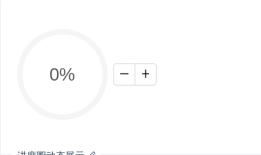
进度圈动态展示
会动的进度条才是好进度条。
import { Component } from '@angular/core';@Component({selector: 'nz-demo-progress-circle-dynamic',template: `<nz-progress [nzPercent]="percent" nzType="circle"></nz-progress><nz-button-group><button nz-button (click)="decline()"><i nz-icon nzType="minus"></i></button><button nz-button (click)="increase()"><i nz-icon nzType="plus"></i></button></nz-button-group>`,styles: [`nz-progress {margin-right: 8px;}`]})export class NzDemoProgressCircleDynamicComponent {percent = 0;increase(): void {this.percent = this.percent + 10;if (this.percent > 100) {this.percent = 100;}}decline(): void {this.percent = this.percent - 10;if (this.percent < 0) {this.percent = 0;}}}

自定义文字格式
nzFormat 属性指定格式。
import { Component } from '@angular/core';@Component({selector: 'nz-demo-progress-format',template: `<nz-progress [nzPercent]="75" nzType="circle" [nzFormat]="formatOne"></nz-progress><nz-progress [nzPercent]="100" nzType="circle" [nzFormat]="formatTwo"></nz-progress>`,styles: [`nz-progress {margin-right: 8px;margin-bottom: 8px;display: inline-block;}`]})export class NzDemoProgressFormatComponent {formatOne = (percent: number) => `${percent} Days`;formatTwo = () => `Done`;}

分段进度条
标准的进度条。
import { Component } from '@angular/core';@Component({selector: 'nz-demo-progress-segment',template: `<nz-progressnz-tooltipnzTitle="3 done / 3 in progress / 4 to do"[nzPercent]="60"[nzSuccessPercent]="30"></nz-progress>`})export class NzDemoProgressSegmentComponent {}
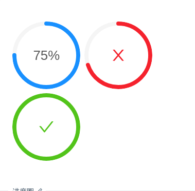
进度圈
圈形的进度。
import { Component } from '@angular/core';@Component({selector: 'nz-demo-progress-circle',template: `<nz-progress [nzPercent]="75" nzType="circle"></nz-progress><nz-progress [nzPercent]="70" nzType="circle" nzStatus="exception"></nz-progress><nz-progress [nzPercent]="100" nzType="circle"></nz-progress>`,styles: [`nz-progress {margin-right: 8px;margin-bottom: 8px;display: inline-block;}`]})export class NzDemoProgressCircleComponent {}

小型进度圈
小一号的圈形进度。
import { Component } from '@angular/core';@Component({selector: 'nz-demo-progress-circle-mini',template: `<nz-progress [nzPercent]="75" nzType="circle" [nzWidth]="80"></nz-progress><nz-progress [nzPercent]="70" nzType="circle" [nzWidth]="80" nzStatus="exception"></nz-progress><nz-progress [nzPercent]="100" nzType="circle" [nzWidth]="80"></nz-progress>`,styles: [`nz-progress {margin-right: 8px;margin-bottom: 8px;display: inline-block;}`]})export class NzDemoProgressCircleMiniComponent {}

动态展示
会动的进度条才是好进度条。
import { Component } from '@angular/core';@Component({selector: 'nz-demo-progress-dynamic',template: `<nz-progress [nzPercent]="percent"></nz-progress><nz-button-group><button nz-button (click)="decline()"><i nz-icon nzType="minus"></i></button><button nz-button (click)="increase()"><i nz-icon nzType="plus"></i></button></nz-button-group>`})export class NzDemoProgressDynamicComponent {percent = 0;increase(): void {this.percent = this.percent + 10;if (this.percent > 100) {this.percent = 100;}}decline(): void {this.percent = this.percent - 10;if (this.percent < 0) {this.percent = 0;}}}

仪表盘
通过设置 nzType="dashboard",可以很方便地实现仪表盘样式的进度条。
import { Component } from '@angular/core';@Component({selector: 'nz-demo-progress-dashboard',template: `<nz-progress [nzPercent]="75" nzType="dashboard"></nz-progress>`})export class NzDemoProgressDashboardComponent {}

圆角/方角边缘
通过设定 nzStrokeLinecap='square|round' 可以调整进度条边缘的形状。
import { Component } from '@angular/core';@Component({selector: 'nz-demo-progress-round',template: `<nz-progress nzStrokeLinecap="square" nzPercent="75"></nz-progress><nz-progress nzStrokeLinecap="square" nzType="circle" nzPercent="75"></nz-progress><nz-progress nzStrokeLinecap="square" nzType="dashboard" nzPercent="75"></nz-progress>`})export class NzDemoProgressRoundComponent {}
API
nz-progresscomponent
| 属性 | 说明 | 类型 | 默认值 |
|---|---|---|---|
[nzFormat] | 内容的模板函数 | (percent: number) => string | percent => percent + '%' |
[nzGapDegree](nzType=circle) | 圆形进度条缺口角度,可取值 0 ~ 360 | number | 0 |
[nzGapPosition](nzType=circle) | 圆形进度条缺口位置 | 'top' | 'right' | 'bottom' | 'left' | 'top' |
[nzPercent] | 百分比 | number | 0 |
[nzShowInfo] | 是否显示进度数值或状态图标 | boolean | true |
[nzStatus] | 状态 | 'success' | 'exception' | 'active' | 'normal' | - |
[nzStrokeWidth](nzType=line) | 进度条线的宽度,单位 px | number | 8 |
[nzStrokeWidth](nzType=circle) | 圆形进度条线的宽度,单位是进度条画布宽度的百分比 | number | 6 |
[nzType] | 类型 | 'line' | 'circle' | 'dashboard' | 'line' |
[nzWidth](nzType=circle) | 圆形进度条画布宽度,单位 px | number | 132 |
[nzStrokeLinecap] | 进度条端点形状 | 'round' | 'square' | 'round' |
[nzStrokeColor] | 进度条颜色 | string | - |
