 我的书签
我的书签
 添加书签
添加书签 移除书签
移除书签- 引入
- 代码演示
- 不同位置
- 其他配置
- API
- Popup Props
- PopupTitleBar Props
- Popup Events
- @beforeShow()
- @show()
- @beforeHide()
- @hide()
- PopupTitleBar Events
- @confirm()
- @cancel()
Popup 弹出层

由其他控件触发,屏幕滑出或弹出一块自定义内容区域
引入
import { Popup, PopupTitleBar } from 'mand-mobile'Vue.component(Popup.name, Popup)Vue.component(PopupTitleBar.name, PopupTitleBar)
代码演示
不同位置
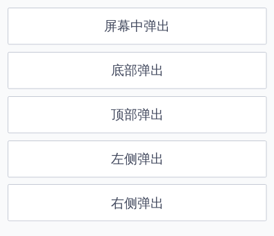
<template><div class="md-example-child md-example-child-popup md-example-child-popup-0"><md-button @click="showPopUp('center')">屏幕中弹出</md-button><md-popup v-model="isPopupShow.center"><div class="md-example-popup md-example-popup-center">Popup Center</div></md-popup><md-button @click="showPopUp('bottom')">底部弹出</md-button><md-popupv-model="isPopupShow.bottom"position="bottom"><md-popup-title-bartitle="Popup Title"describe="Popup Description"ok-text="ok"cancel-text="cancel"large-radius@confirm="hidePopUp('bottom')"@cancel="hidePopUp('bottom')"></md-popup-title-bar><div class="md-example-popup md-example-popup-bottom">Popup Bottom</div></md-popup><md-button @click="showPopUp('top')">顶部弹出</md-button><md-popupv-model="isPopupShow.top":hasMask="false"position="top"><div class="md-example-popup md-example-popup-top">Popup Top<md-iconname="close"@click.native="hidePopUp('top')"></md-icon></div></md-popup><md-button @click="showPopUp('left')">左侧弹出</md-button><md-popupv-model="isPopupShow.left"position="left"><div class="md-example-popup md-example-popup-left">Popup Left</div></md-popup><md-button @click="showPopUp('right')">右侧弹出</md-button><md-popupv-model="isPopupShow.right"position="right"><div class="md-example-popup md-example-popup-right">Popup Right</div></md-popup></div></template><script>import {Popup, PopupTitleBar, Button, Icon} from 'mand-mobile'export default {name: 'popup-demo',components: {[Popup.name]: Popup,[PopupTitleBar.name]: PopupTitleBar,[Button.name]: Button,[Icon.name]: Icon,},data() {return {isPopupShow: {},}},methods: {showPopUp(type) {this.$set(this.isPopupShow, type, true)},hidePopUp(type) {this.$set(this.isPopupShow, type, false)},},}</script><style lang="stylus">.md-example-child-popup-0float leftwidth 100%.md-buttonmargin-bottom 20px.md-example-popupposition relativefont-size 28pxfont-family DINProfont-weight 500box-sizing border-boxtext-align centerbackground-color #FFF.md-example-popup-centerpadding 50pxborder-radius radius-normal.md-example-popup-topwidth 100%height 75pxline-height 75pxbackground #4a4c5bcolor #fff.md-iconposition absoluteright 20pxtop 50%transform translateY(-50%).md-example-popup-bottomwidth 100%padding 100px 0pline-height 50px.md-example-popup-left, .md-example-popup-rightheight 100%padding 0 150pxdisplay flexalign-items center</style>
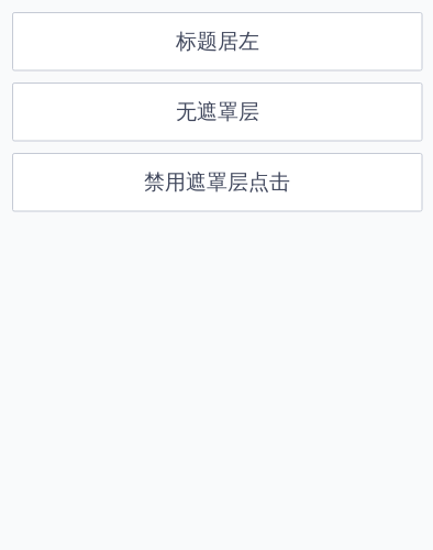
其他配置
        <template>
  <div class="md-example-child md-example-child-popup md-example-child-popup-2">
    <md-button @click="showPopUp('align')">标题居左</md-button>
    <md-popup
      class="inner-popup"
      v-model="isPopupShow.align"
      position="bottom"
    >
      <md-popup-title-bar
        only-close
        large-radius
        title="标题"
        describe="title & description align left"
        title-align="left"
        @cancel="hidePopUp('align')"
      ></md-popup-title-bar>
      <div class="md-example-popup md-example-popup-align">
        <md-scroll-view :scrolling-x="false">
          <p>Scroll View</p>
        </md-scroll-view>
      </div>
    </md-popup>

    <md-button @click="showPopUp('top')">无遮罩层</md-button>
    <md-popup
      v-model="isPopupShow.top"
      :hasMask="false"
      position="top"
    >
      <div class="md-example-popup md-example-popup-top">
        Popup Top
        <md-icon
          name="close"
          @click.native="hidePopUp('top')"
        ></md-icon>
      </div>
    </md-popup>

    <md-button @click="showPopUp('mask')">禁用遮罩层点击</md-button>
    <md-popup
      v-model="isPopupShow.mask"
      position="bottom"
      :mask-closable="false"
    >
      <md-popup-title-bar
        only-close
        large-radius
        @confirm="hidePopUp('mask')"
        @cancel="hidePopUp('mask')"
      ></md-popup-title-bar>
      <div class="md-example-popup md-example-popup-bottom">
        <p>Recording</p>
        <!-- By Sam Herbert (@sherb), for everyone. More @ http://goo.gl/7AJzbL -->
        <svg width="55" height="80" viewBox="0 0 55 80" xmlns="http://www.w3.org/2000/svg" fill="#2f86f6">
          <g transform="matrix(1 0 0 -1 0 80)">
            <rect width="10" height="20" rx="3">
              <animate attributeName="height" begin="0s" dur="4.3s" values="20;45;57;80;64;32;66;45;64;23;66;13;64;56;34;34;2;23;76;79;20" calcMode="linear" repeatCount="indefinite" />
            </rect>
            <rect x="15" width="10" height="80" rx="3">
              <animate attributeName="height" begin="0s" dur="2s" values="80;55;33;5;75;23;73;33;12;14;60;80" calcMode="linear" repeatCount="indefinite" />
            </rect>
            <rect x="30" width="10" height="50" rx="3">
              <animate attributeName="height" begin="0s" dur="1.4s" values="50;34;78;23;56;23;34;76;80;54;21;50" calcMode="linear" repeatCount="indefinite" />
            </rect>
            <rect x="45" width="10" height="30" rx="3">
              <animate attributeName="height" begin="0s" dur="2s" values="30;45;13;80;56;72;45;76;34;23;67;30" calcMode="linear" repeatCount="indefinite" />
            </rect>
          </g>
        </svg>
      </div>
    </md-popup>
  </div>
</template>

<script>
import {Popup, PopupTitleBar, ScrollView, Button, Icon} from 'mand-mobile'

export default {
  name: 'popup-demo',
  components: {
    [Popup.name]: Popup,
    [PopupTitleBar.name]: PopupTitleBar,
    [Button.name]: Button,
    [Icon.name]: Icon,
    [ScrollView.name]: ScrollView,
  },
  data() {
    return {
      isPopupShow: {},
    }
  },
  methods: {
    showPopUp(type) {
      this.$set(this.isPopupShow, type, true)
    },
    hidePopUp(type) {
      this.$set(this.isPopupShow, type, false)
    },
  },
}

</script>

<style lang="stylus">
.md-example-child-popup-2
  float left
  width 100%
  .md-button
    margin-bottom 20px
  .md-popup-title-bar
    .md-popup-cancel
      .md-icon
        align-self flex-start
        margin-left 32px
  .md-example-popup
    position relative
    font-size font-minor-large
    background color-bg-base
    box-sizing border-box
    text-align center
    background-color #FFF
  .md-example-popup-align
    padding 0 40px
    .md-scroll-view
      height 500px
      background #EEE
      p
        line-height 500px
        font-size 64px
        font-weight 200
        color #999
  .md-example-popup-top
    width 100%
    height 75px
    line-height 75px
    background #4a4c5b
    color #fff
    .md-icon
      position absolute
      right 20px
      top 50%
      transform translateY(-50%)
  .md-example-popup-bottom
    width 100%
    padding 0 0 150px
    p
      margin-bottom 100px
      font-size 64px
      font-weight 200
      color #999
  .md-example-popup-left, .md-example-popup-right
    height 100%
    padding 0 150px
    display flex
    align-items center
</style>
API
Popup Props
| 属性 | 说明 | 类型 | 默认值 | 备注 |
|---|---|---|---|---|
| v-model | 弹出层是否可见 | Boolean | false | - |
| has-mask | 是否有蒙层 | Boolean | true | - |
| mask-closable | 点击蒙层是否可关闭弹出层 | Boolean | true | - |
| position | 弹出层位置 | String | center | center, top, bottom, left, right |
| transition | 弹出层过度动画 | String | - | fade, fade-bounce, fade-slide, fade-zoom slide-up, slide-down, slide-left, slide-right |
PopupTitleBar Props
| 属性 | 说明 | 类型 | 默认值 | 备注 |
|---|---|---|---|---|
| title | 标题 | String | - | - |
| describe | 描述 | String | - | - |
| ok-text | 确认按钮文案 | String | - | 为空则没有确认按钮 |
| cancel-text | 取消按钮文案 | String | - | 为空则没有取消按钮 |
| large-radius 2.4.0+ | 大圆角模式 | Boolean | false | - |
| only-close 2.4.0+ | 只有右侧关闭按钮 | Boolean | false | - |
| title-align 2.4.0+ | 标题和描述位置 | String | center | 注意left和right时会分别隐藏左右两侧按钮 |
Popup Events
@beforeShow()
弹出层即将展示事件
@show()
弹出层展示事件
@beforeHide()
弹出层即将隐藏事件
@hide()
弹出层隐藏事件
PopupTitleBar Events
@confirm()
确认选择事件
@cancel()
取消选择事件
